In case you missed the memo, #bcpturns25 this year! We wanted to take this opportunity to walk our old friends down logo memory lane and share an interesting story with our new friends, too.
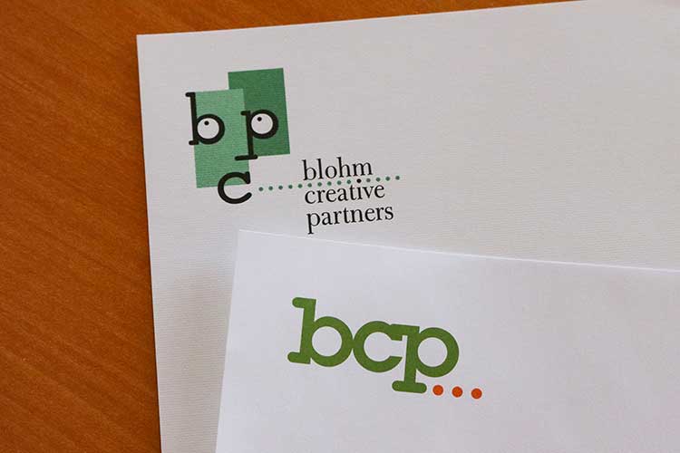
Our first official BCP logo was designed in 1999 by one of our former graphic designers, Kelly Hansen. Rumor has it that this particular shade of green was chosen because it matched the color of the walls in our old office (a very official color selection process, as you can see). The eyes inside the “b” and the “p” pair together with the letter “c” to form a whimsical face that spoke to our playful and creative approach to advertising and design.
In 2009, our team decided that our logo needed a fresh look and feel. We were growing as an agency, and wanted a logo that symbolized our serious approach to business and our well-established techniques in creative advertising.
So, we decided to evolve, not depart from, our previous logo by using the same font and adopting energetic, bright colors.
But our favorite part of our logo comes after our name. If you’ve ever seen our business cards, stationary, or website, then you know we love polka dots. We revamped the polka dots in our logo to form an ellipses. Why an ellipses? It illustrates that our current marketing magic is only part of the larger picture. There’s always more to come from BCP.