When it comes to designing your marketing materials, there’s no single answer or formula. From business cards to websites, magazines to digital ads, our standout creatives Tim and Carly are your partners in creating the best design for your needs. But even with graphic design being personalized, our designers have some thoughts on their favorite and least favorite trends.
Here are four design trends Tim and Carly love….
Simplicity
“Direct and to the point is the best avenue for communicating – cleaner, simpler design does that. It requires you to be intentional with your design choices,” says Tim. “You don’t need to fill all the empty space – it can overwhelm the viewer. It needs to be a combination that attracts attention, but communicates quickly.”
Flat Vector Art

“Flat vector art might change with style, but it’s always a recurring theme – from art deco, to these kinds of people we see a lot now,” says Carly.
Retro

“What retro is changes over time – what’s in now will be retro in the future. It’s more of an approach than what the exact design looks like,” says Tim. “I especially like retro typography, which is becoming more rare but stands out.”
Incorporating Type in Images

Tim says, “Carly and I both do this a lot – it gives a graphic extra depth and interest. It’s more interactive between the photo subject and the text, and adds cohesion.”
… and two they don’t.
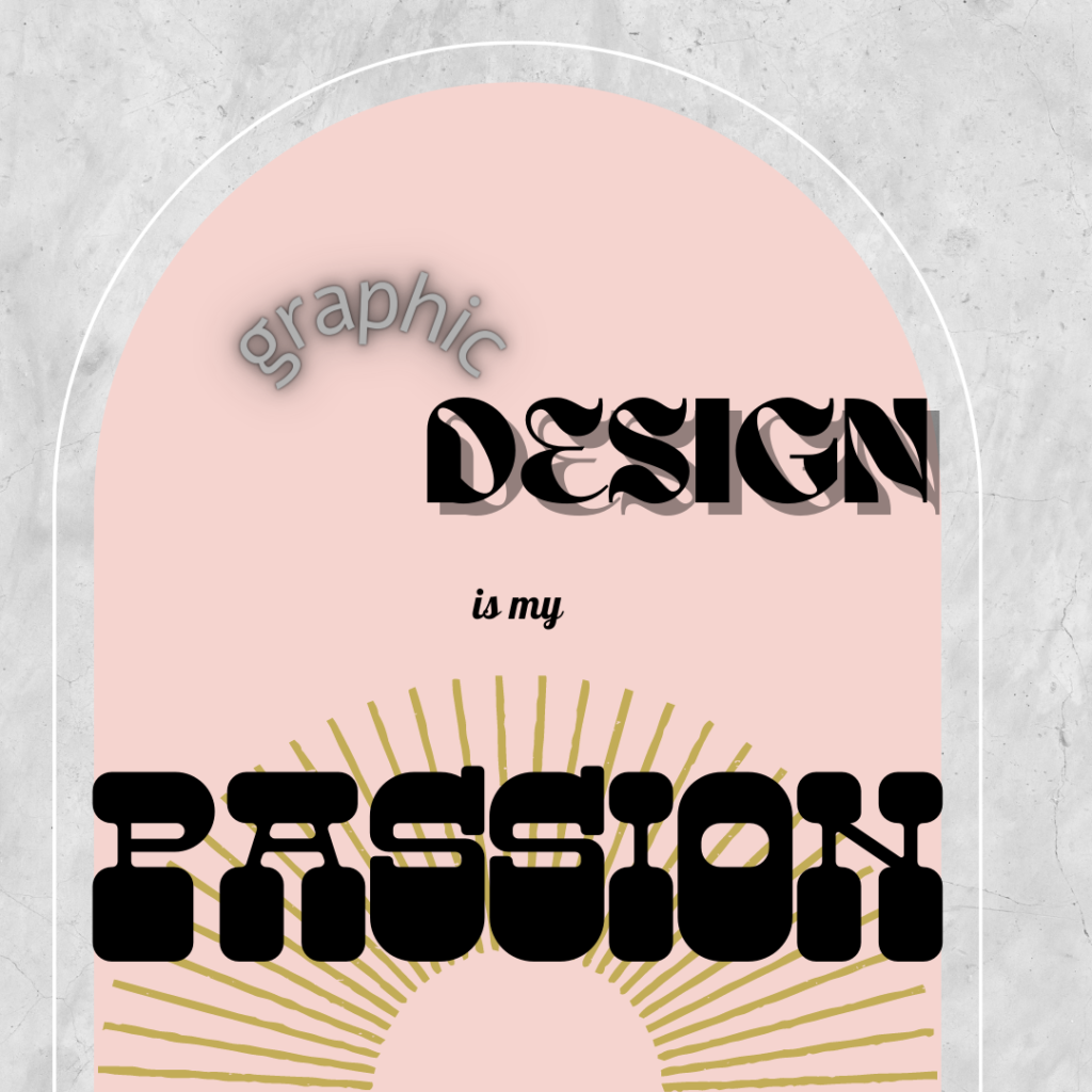
Arches

“More than anything, it’s an element that’s overused. Too much of a good thing isn’t a good thing anymore,” says Carly. “There’s a lot of places where it can be used in a great way – there’s nothing wrong with a square and a circle being mashed together – but especially in influencer and social media culture, it’s oversaturated and not always appropriate.”
Drop Shadows

“Drop shadows are a trend that won’t go away. Unless it’s in the context of some sort of photoshopped graphic, drop shadows on type just interfere with the text, and make it look less professional. The only time I think it’s acceptable is to create more contrast,” says Tim.
“If you’re going to use a drop shadow, use them very delicately, but not in-your-face. It can make things look dated so fast,” Carly adds.
Ready to get started on your next design project? Hit us up today!