Web & Rebranding Case Study
Client: Greater Lansing Food Bank
Challenge:
The Greater Lansing Food Bank has been feeding people in need in mid-Michigan for more than 30 years. Having recently merged with another local food bank and become a member of Feeding America, the GLFB knew the time was right to create an updated, cohesive brand that positioned it as THE food bank serving the mid-Michigan region. As with any long-established organization, however, there was concern that a change in visual identity, coupled with the merger and new affiliation, might cause confusion in the marketplace and adversely affect donations.
Solution:
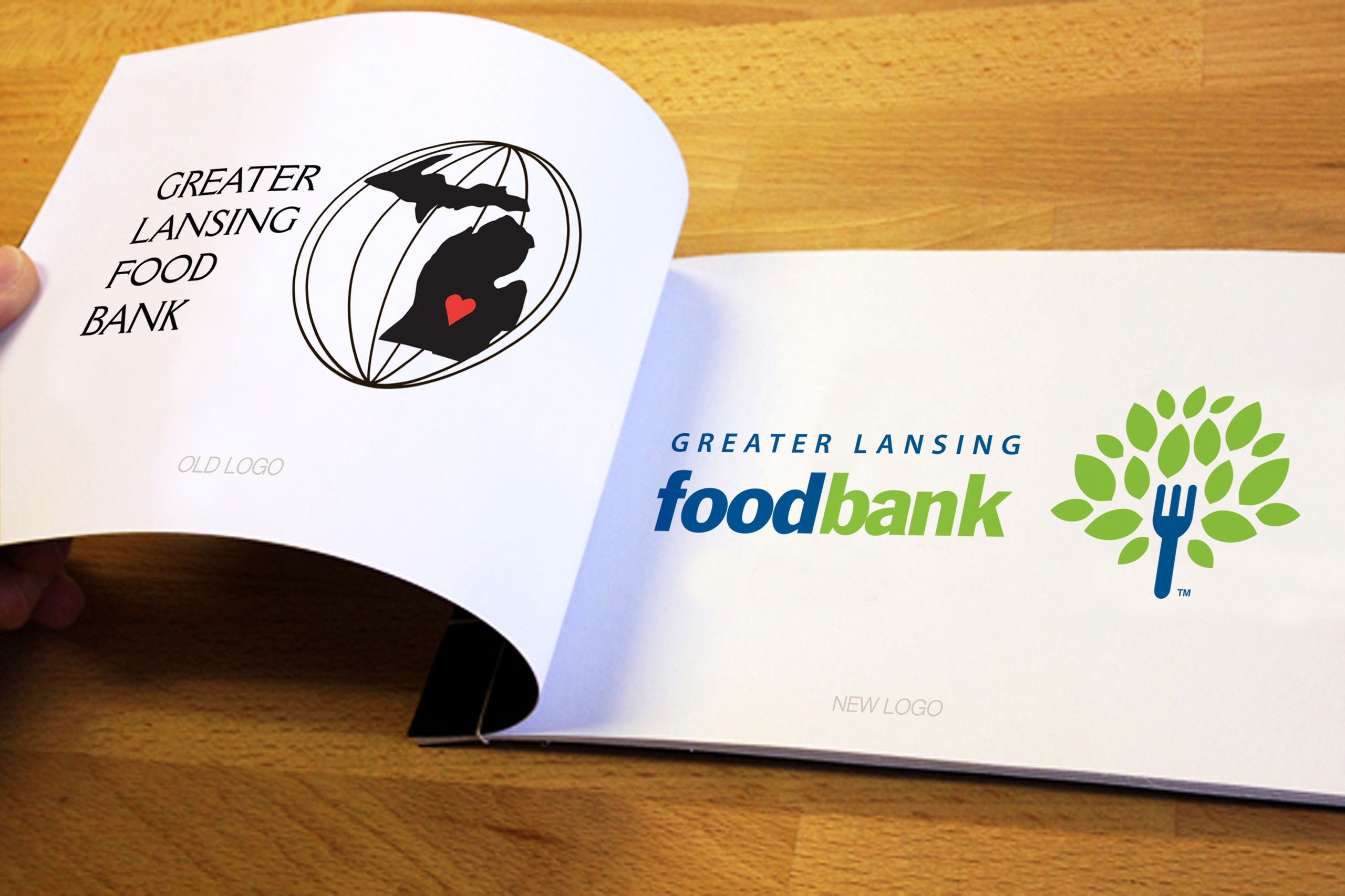
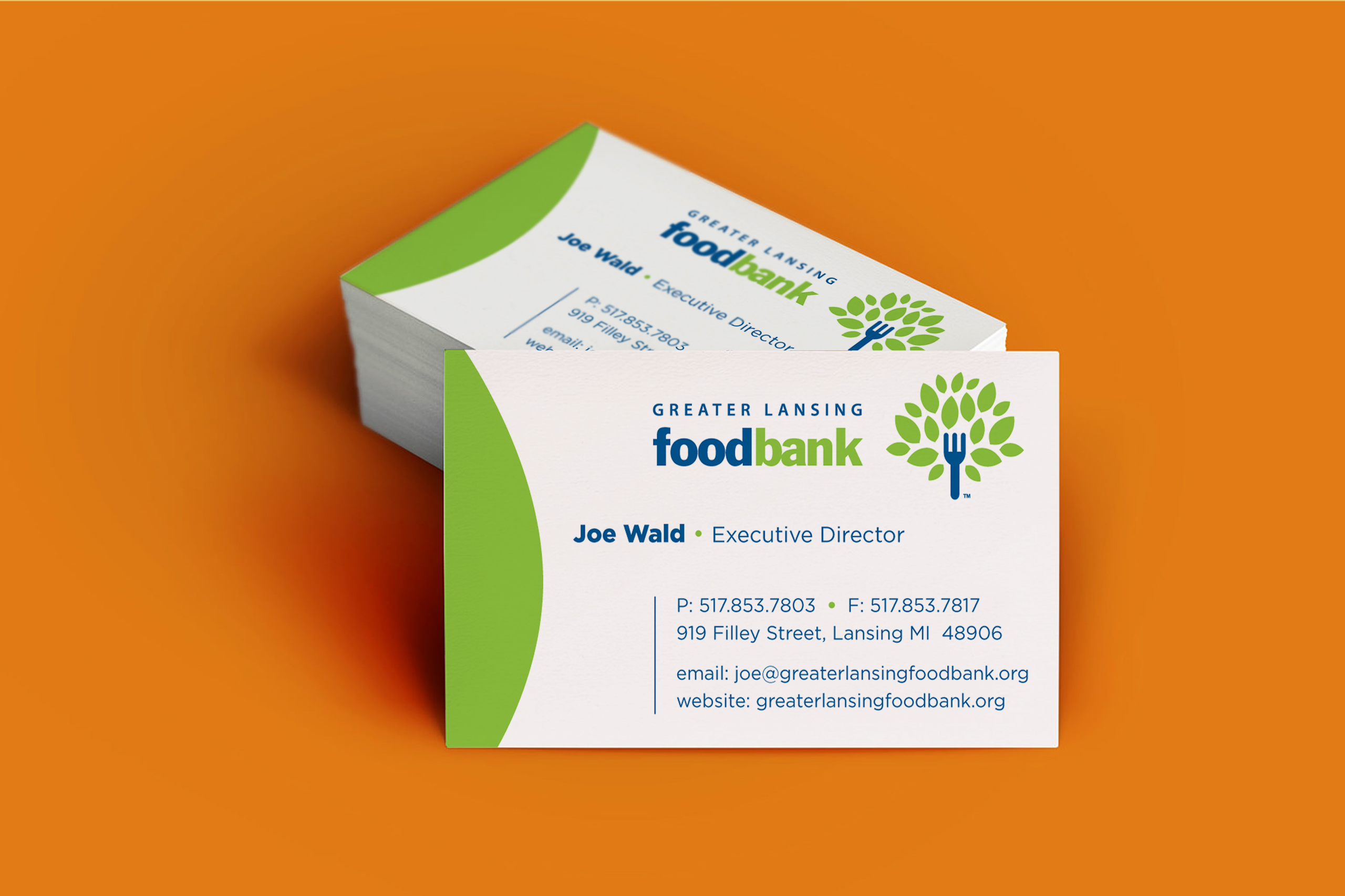
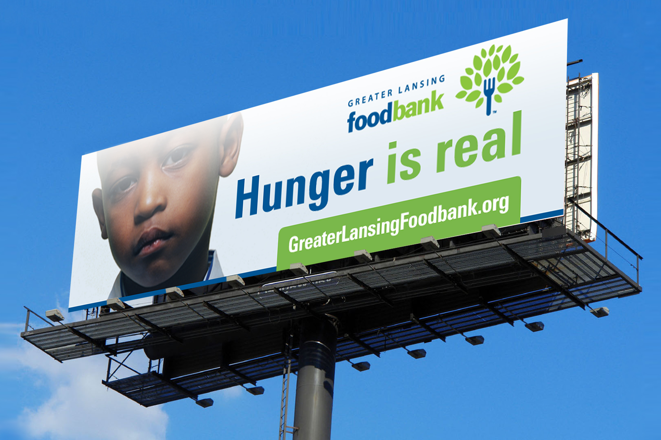
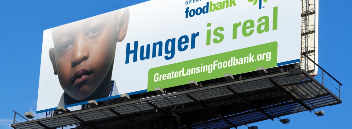
BCP first created a fresh, vibrant logo. While sometimes logos “evolve” from previous iterations, the GLFB team agreed that a brand new look was needed. In addition, the old familiar logo was fine-lined and detailed, and did not read well at a distance—a distinct liability for outdoor advertising, which is one of the cornerstones of GLFB’s annual envelope campaign, its single largest fundraising event each year.
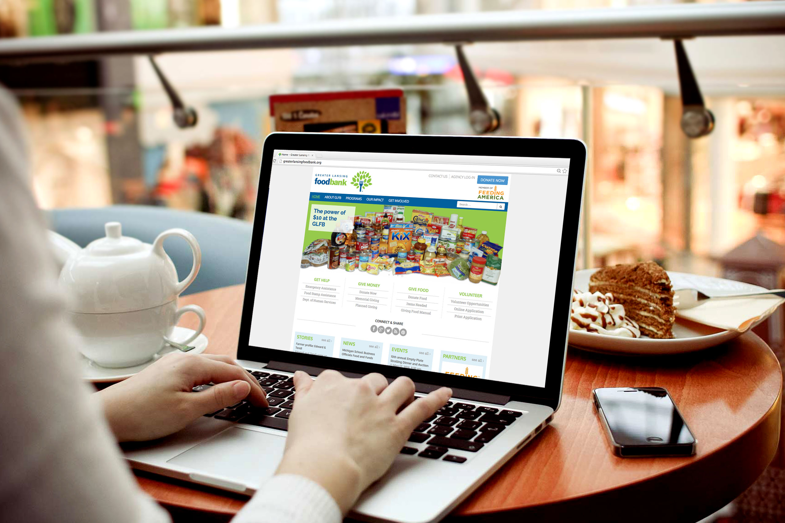
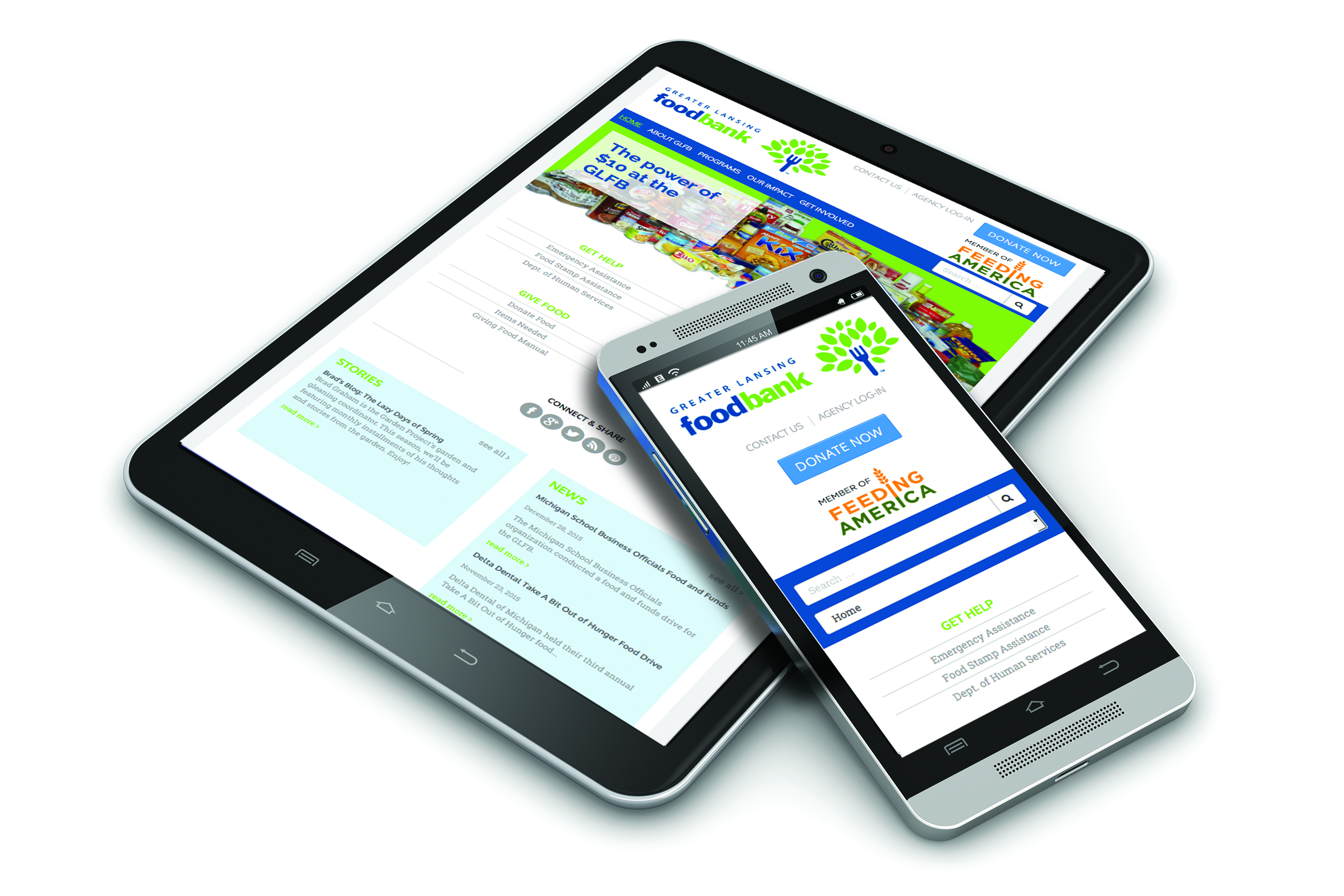
Once the logo was developed, we dove into restructuring and redesigning the website. In addition to incorporating the new brand, the site needed streamlining, simplifying, and, above all, needed to make it easy for people to donate. The new look and the new website were launched in time for the 2013/2014 holiday envelope campaign, capitalizing on the high-volume, high-visibility promotion surrounding the campaign. Not only did the campaign top $1 million, but the new ease and prominent call to action of donating via the website greatly increased the percentage of online donations.