Design Case Study
Client: Michigan Apple Committee
Challenge:
Since 1939, the Michigan Apple Committee (MAC) has supported marketing, communications and consumer education on behalf of Michigan’s apple growers. A few years ago, in response to an increasingly competitive marketplace, the MAC decided that its brand needed to be refreshed and, to a degree, repositioned. In particular, MAC wanted to further differentiate Michigan apples in the marketplace by emphasizing the unique, delicious flavors created by the Great Lakes’ climate and nutrient-rich soils.
Solution:
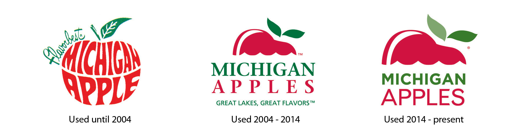
BCP and the MAC were on the same page: The red and green used in the logo over the years had created brand equity and continuity worth building on. Yet we also believed it was important to freshen the logo and include some visual reference to the Great Lakes.
BCP updated the hard-to-read script font to a more modern type and evolved the logo mark, incorporating a visual nod to the waves of Lake Michigan. BCP also developed accompanying taglines, ”Great Lakes. Great Flavors,” and “Where Apples Love to Grow.”
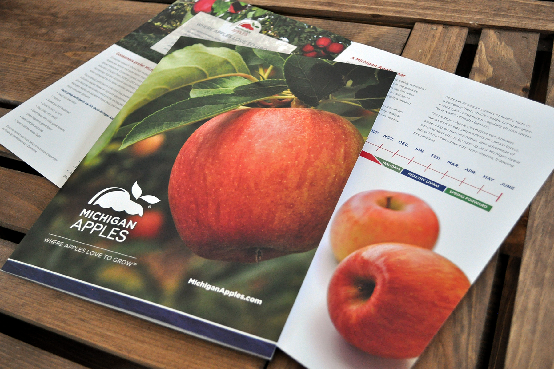
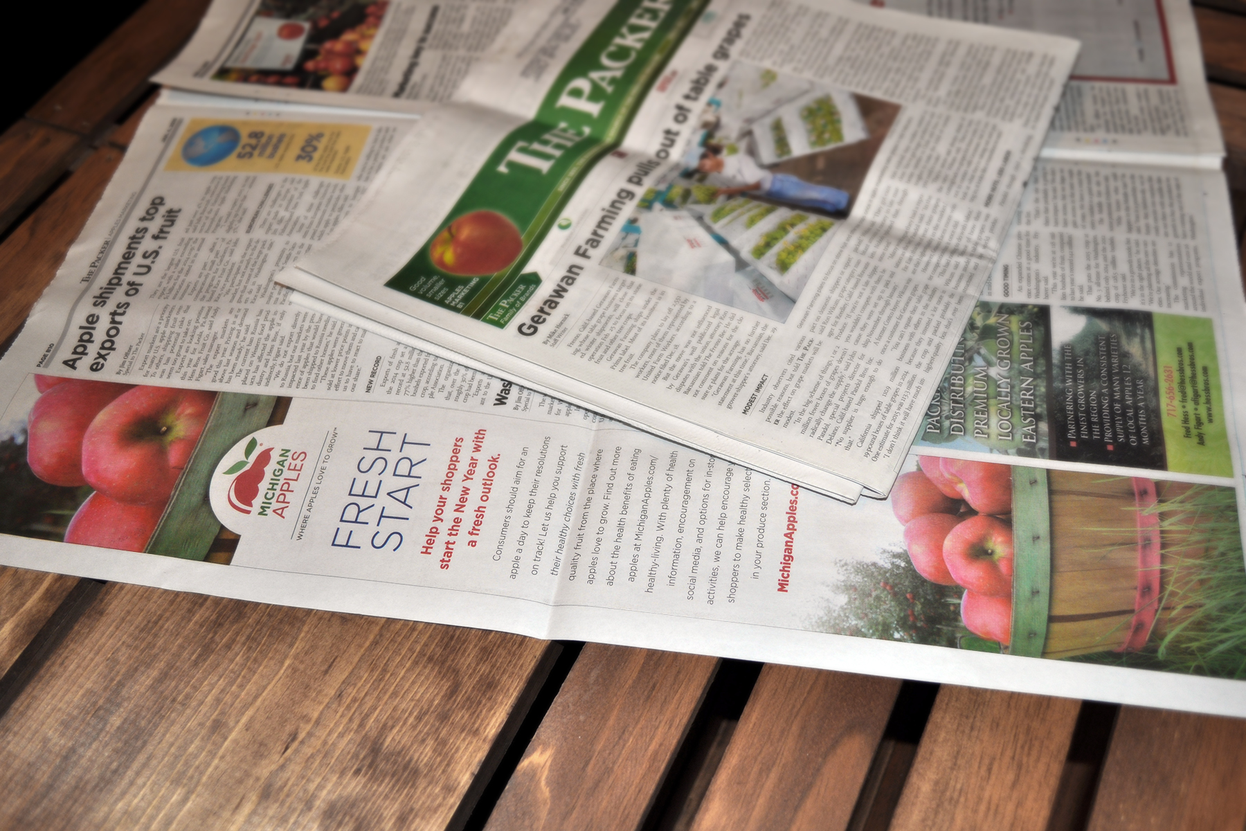
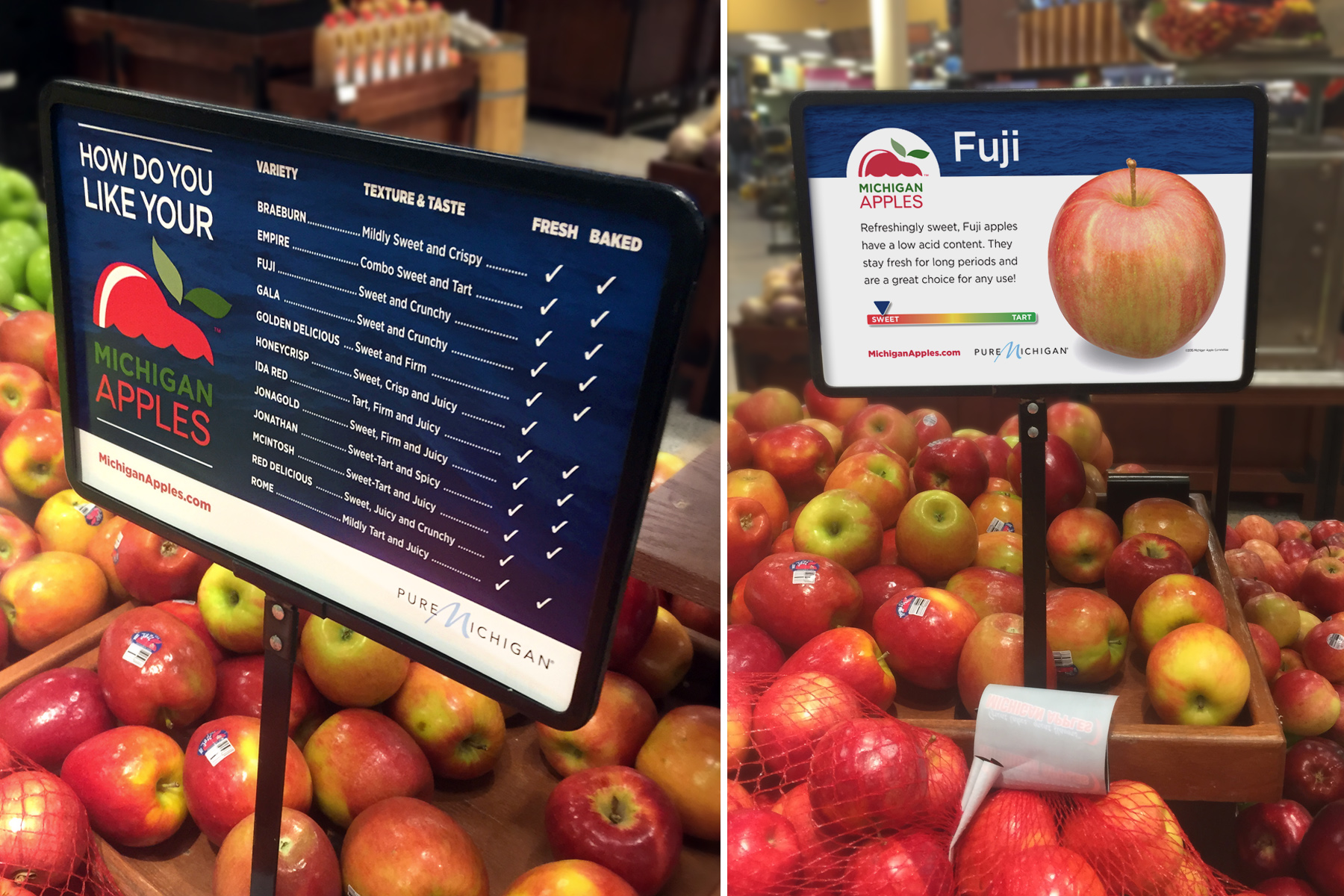
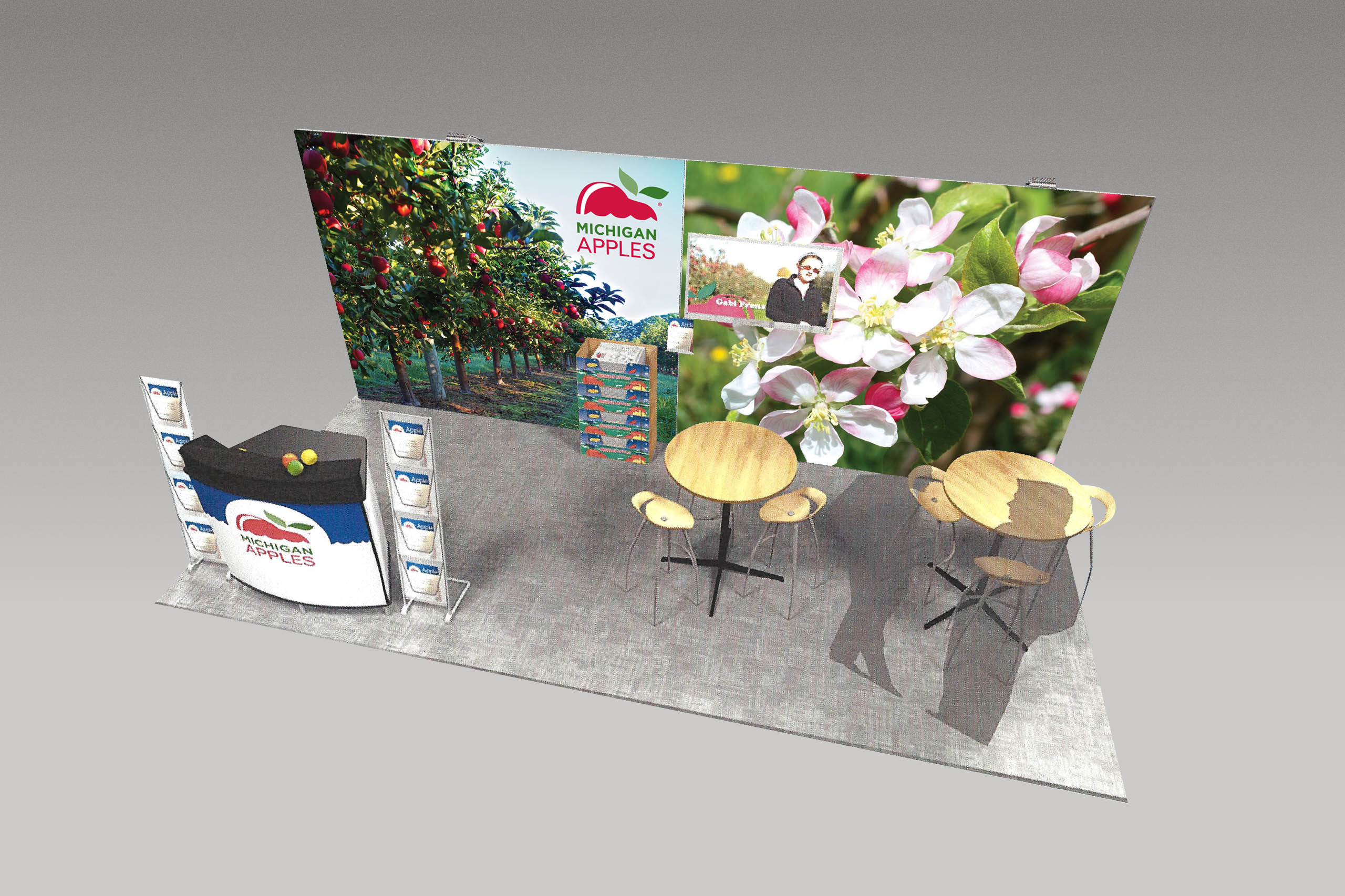
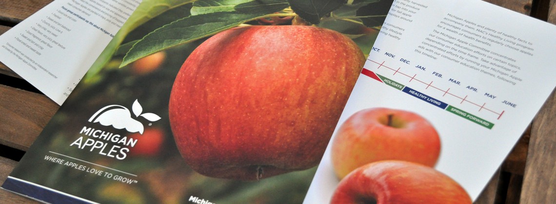
We then worked to bring other marketing materials up to date and “on message,” developing infographics and custom seasonal photography to help tell the Michigan Apples story.
BCP continues working with the MAC on marketing programs, educational materials, trade show materials, etc. The MAC is proud of Michigan’s position as the third-largest apple-producing state in the U.S., and BCP is proud to help the MAC expand into new markets and continue its success.